The Law of Cost Structure Invariance
Abundance requires deflation.
At a fundamental level, raising the standard of living means making goods and services more affordable to everyone. Lest the economists get upset, it’s not just any form of deflation, to be precise: it’s technological deflation, which is prolonged and sustained, and arises from increased productivity or better products. The path to prosperity comes from understanding how goods become cheap.
A common refrain is that cost reduction comes from economies of scale and learning effects. For every doubling of cumulative capacity, the unit costs drop by a certain percentage. That percentage value is called the learning rate, and it varies by industry and by product. This phenomenon is sometimes called “Wright’s law” and has been observed in virtually every industry1.
But if someone were to ask how solar panels became so inexpensive,2 “learning curve effects” feels like a non-answer. It’s describing a consequence of other causal mechanisms, not a cause in itself. It might say something about the pace of cost reductions, but it can’t say anything about their nature.
I think most would agree that the latter is far more interesting, but it necessitates diving into the details of each individual scenario. With such a breadth of potential topics, can there even be any generalizable insights? Is there a “key” to understanding cost reductions?
I believe there is such a key, and it lies in understanding a counterintuitive pattern that emerges across industries: even as technologies radically transform products and slash costs, the optimal allocation of expenses remains remarkably constant. To see how this manifests in practice, let’s examine several case studies of dramatic price deflation.
Semiconductor chip design
The story of the semiconductor industry is the archetypical example.
To this day, it remains perhaps the finest demonstration of the power of human ingenuity and industry. As it went from the crude, hand-soldered contraptions of the ’50s to the atomically precise marvels of today, the industry reshaped the world—and itself.
Decade after decade, die shrink after die shrink, reliably and inevitably: the cost of computing dropped at an exponential pace. Computation went from an activity of powerful nation-states, to one of corporations, to a luxury, to a necessity, to a commodity.
This was the crux of Gordon Moore’s original prediction. It’s been twisted into a statement about technical performance—i.e., transistor densities—over the years, but it was originally about economics. Specifically, Moore predicted that the economically optimal transistor density would double roughly every 2 years.
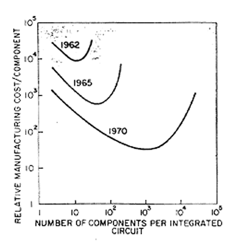
For most people, this is the more salient metric: it relates the amount of resources they need to expend to obtain a given amount of computing power. This sustained exponential cost decline is what ultimately enabled the mass adoption of computers.
Moore’s law: still alive, but ailing
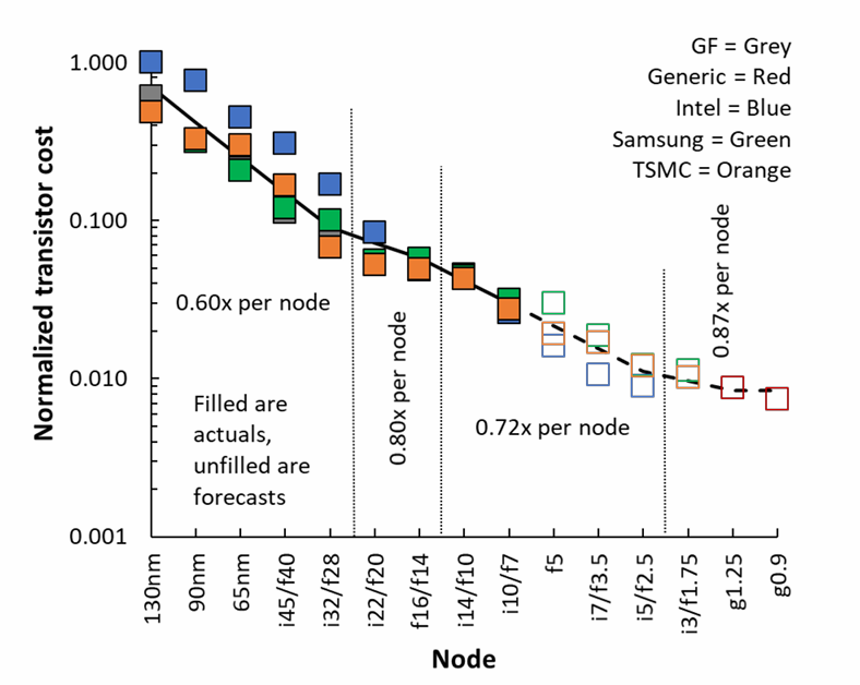
Mainstream publications love to repeat that Moore’s law is dead. It doesn’t take long to find stories about how transistors have been getting more expensive since the 28 nm process node, and about the fabulously exorbitant construction costs of leading-edge chip foundries. The reality is more complex. Chip manufacturing costs are still declining on a per-transistor basis.
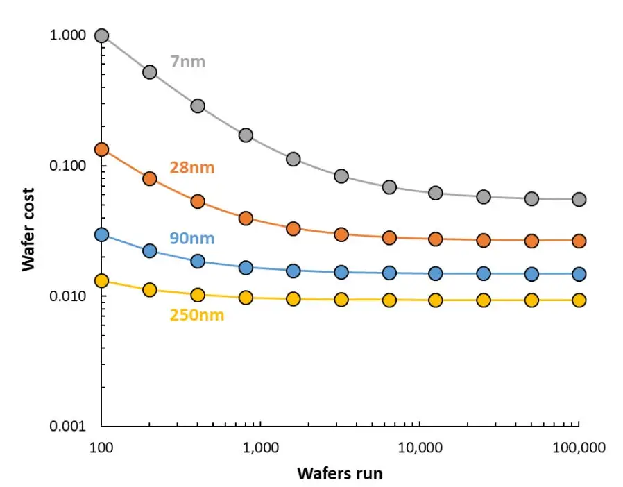
The problem lies in the fixed costs, stemming from the exponentially growing complexity of the design process. Firstly, photolithographic mask sets, the “stencils” used to manufacture a chip design, are getting more expensive. A mask set in a leading edge process node can cost tens of millions of dollars.
In conjunction with that, chip development costs are exploding.
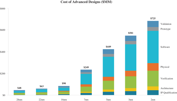
On its own, this isn’t the end of the world. Chip design costs, on a per-transistor basis, are still dropping, albeit more slowly.
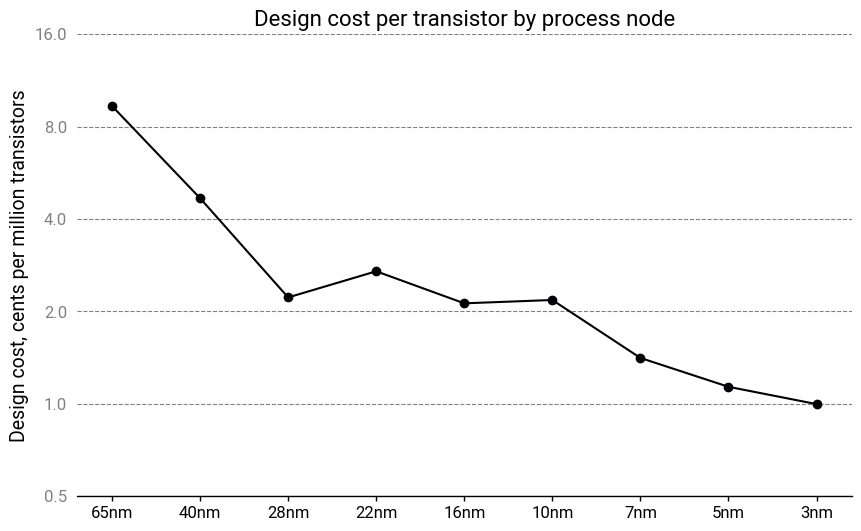
The issue is that with soaring fixed costs, very large production runs are required to make the economics work. With each new process node, fewer and fewer chips will have the sales volumes to justify upgrading, leaving only the largest players—the Apples, the Nvidias, the Broadcoms—able to offer the latest technologies. This is less than ideal for many reasons that have been discussed at length.
So why is chip design getting more expensive? When industry insiders say that design complexity is growing exponentially, they mean it.
The exponential complexity of chip design
The biggest cost drivers in chip design are physical design, verification, and software development:
- Physical design involves, as the name suggests, the layout of the physical elements of the circuit. It starts with a schematic (more pedantically, the netlist) of the desired circuit and ends with instructions to fabricate the mask set for prototyping.
- Verification ensures the proposed design will work by simulating the chip and its manufacturing process. The level of fidelity can range from relatively simple logical analysis to simulating the fundamental physics at the transistor level if needed. Some verification happens even before physical design begins, and runs in parallel with a constant back-and-forth between the two steps.
- Software development creates the software required to use the chip. This is a combination of code that runs on the chip but also diagnostic and debug tooling needed to test the chip. Some low-level software is essential for basic chip functionality and must be completed before prototyping begins. Other, higher-level software can be written in parallel during prototyping and chip validation3.
Software development is the simplest one to explain, despite being the largest cost item. Advanced chips need more sophisticated scheduling, power management and memory management algorithms to achieve acceptable performance. They’re expected to support a dizzying array of features: parallel processing, security and authentication, memory isolation, communication protocols, hardware acceleration, dozens or even hundreds of device drivers, and more. Accompanying these features are tools for OEM engineers: multiple hardware configurations, board support packages, compilation toolchains, hardware abstraction layers and middleware. All these configurations, tools, and features create a multiplying set of test cases and interactions, which likely increases at a rate between $O(N^2)$ and $O(N^3)$.
Physical design and verification are suffering from a similar problem, driven by the smaller and more numerous transistors in every chip generation. As we push the physics to the limit, the convenient abstractions we rely on to simplify the designer’s job begin to fail. For instance, what determines whether a transistor is switched on or off? According to basic semiconductor theory, it’s the gate-to-source voltage that determines this. But as sizes shrink, the answer increasingly becomes “it depends”.
Parasitic effects become prominent or even dominant. Interactions with neighboring circuit components can no longer be ignored. Statistical variation becomes thermodynamically unavoidable: a transistor channel region in a 5 nm process might have fewer than 10 dopant atoms!
At the same time, mistakes are getting costlier. A bad design represents a setback of several months for a “respin”—an eternity in the breakneck world of semiconductors—and millions of dollars spent on new photomasks. As a result, having a strong verification pipeline is more important than ever.
Yet the verification step also relies on simplifications and assumptions to make the job tractable. If the behavior of each logic gate can’t be decoupled from the behavior of other logic gates, there is an exponentially growing state space with $O(2^N)$ possible configurations even if you naïvely assume every gate can only have two possible states. With billions of transistors on a single chip, an exhaustive analysis is literally impossible, requiring an amount of computing time so incomprehensibly vast it would make the heat death of the universe seem like a blip in comparison.
Furthermore, many aspects of physical design are tightly intertwined with verification feedback loops, such as optical proximity correction or net routing under multiple patterning constraints . These have their own, often nonlinear complexity scaling rates4. A bottleneck here can easily propagate to the rest of the development process, slowing it to a crawl.
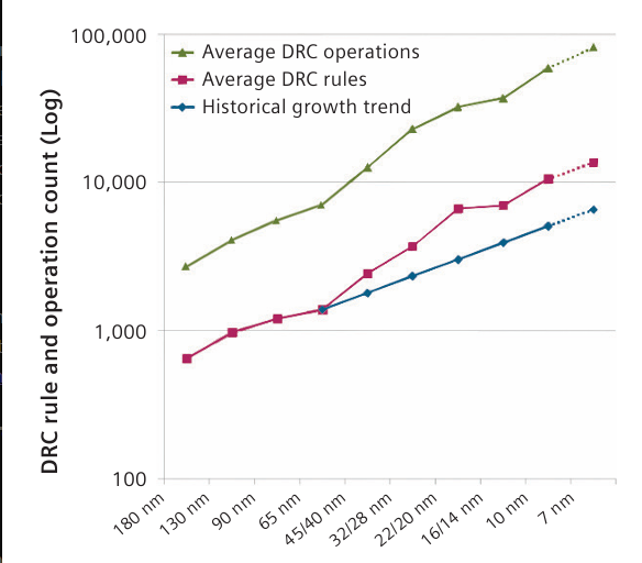
These coupling effects are managed through design rules. These are restrictions on how and where to place circuit elements to avoid difficult-to-predict edge scenarios. In modern workflows, these are handled by a Design Rule Checker (DRC) which automatically detects rule violations, drastically reducing the amount of work required by designers. The DRC allows for the verification stack to be simplified and keeps the number of simulation cases down.
Sadly, this isn’t enough. The number of design rules is growing polynomially with each process node, and each new rule can interact with every other rule, resulting in another combinatorial multiplication of interactions.
Design technologies have exponentially increased productivity
The math is unforgiving: an exponential process, if not immediately tamed, will spiral out of control practically overnight.
The semiconductor industry has long been aware of these challenges. Without a continuous stream of improvements in design tooling and techniques, design costs would have soared into the billions decades ago. A clear sense of the trepidation can be felt in old reports from the International Technology Roadmap for Semiconductors (ITRS). On a regular basis, they lamented that transistor counts were growing faster than the ability to meaningfully design them; that improvements in design technologies were sorely needed; that slippages in the roadmap would lead to exponentially growing costs; that there were no solutions in the pipeline for looming bottlenecks.
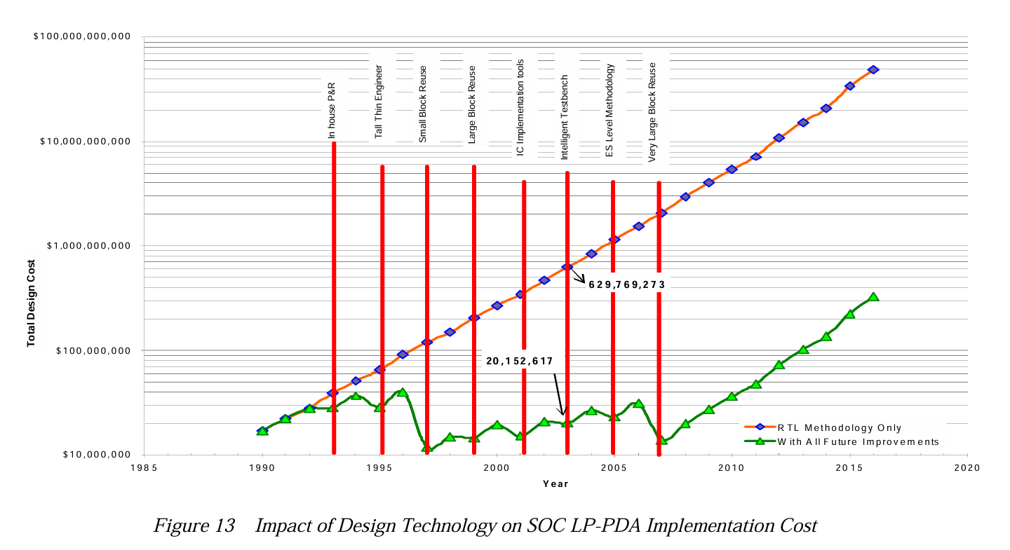
Nevertheless, engineers soldiered on, and for years, the innovations maintained the relentless pace. Costs remained flat as transistor counts multiplied, as new design technologies kept the impending flood of complexity at bay. But in the face of the cruel, inescapable, implacable logic of scaling, they eventually stumbled—and then faltered.
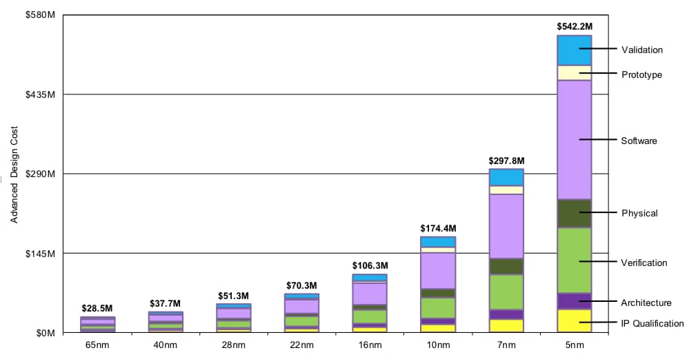
But if we step back from the present woes of the semiconductor industry, we should remember that despite the daunting challenge, designers are still able to keep up and make commercially viable products. To do so, productivity also had to grow exponentially in tandem with transistor counts.
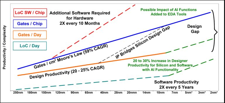
There’s another observation to be made here—one that’s far more interesting for our purposes. Through every process node, the cost structure remained remarkably static—in fact, it’s almost identical!
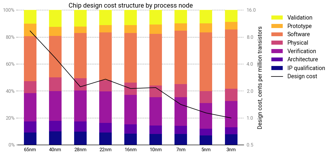
Pretty much every cost item grew in lockstep with the others. How can this be? All cost scalings are equal, but some are more equal than others: certain cost drivers, like verification, should have superlinear scaling. Somehow, productivity improvements almost perfectly masked these effects.
Even more curiously, this pattern—where cost structures remain constant despite nonlinear complexity growth—isn’t unique to semiconductors. Similar dynamics seem to appear across other industries experiencing rapid technological change and price deflation, ranging from desalination to rockets. Despite massive cost reductions, technological innovations, and structural changes, the cost structure of these industries tends to remain constant.
The law of cost structure invariance
What’s going on here? I suspect there’s a phenomenon which I’m going to call the law of cost structure invariance:
The optimal cost structure of a product will remain roughly the same, regardless of improvements to the underlying technology.
‘Cost’ is used here in an abstract sense—it could represent a literal monetary value, but could also refer to some other constraint, like mass or energy. This essay focuses predominantly on the first case.
Many design decisions will represent a tradeoff between different cost items, such as capital costs and energy consumption. As such, there will be some “optimal” combination of inputs that results in the lowest overall production cost, or highest performance on some metric that we care about. The cost structure is thus an output of the resulting optimization.
It’s best to illustrate this with an example. Let’s say we have some engineered system or product with 4 major cost items: labor, material, energy and capital amortization. The cost breakdown below.
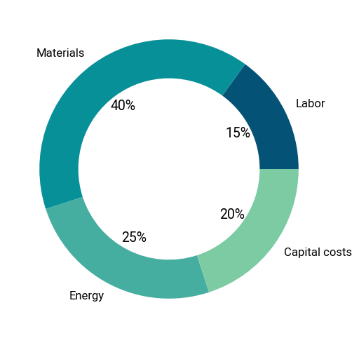
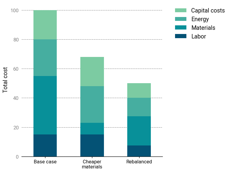
Here, raw materials are originally 40% of the total cost. Now, assume a new technology (for example, a more efficient manufacturing technique) allows us to reduce the amount of materials by 80%. Naïvely passing down the savings would reduce the total system cost by 32%. Not bad!
According to the Law, however, we should expect the optimal cost distribution of the new product to be roughly the same as the incumbent. In other words, when a core input has its cost reduced significantly, an effective design should ideally utilize more of it to reduce the costs of other inputs.
In this case, redesigning the system to use 2X more materials (or materials that are twice as expensive) to achieve the original cost breakdown would be equivalent to a 50% reduction in cost. Much better!
To further illustrate this idea, let’s explore some more examples in detail.
Water desalination
Water desalination has undergone a revolution since the advent of the first large-scale desalination plant in Freeport, Texas. Initially, desalination plants used multi-stage flash distillation (MSF), which employed mature and well-understood technologies at the expense of high energy consumption. Nowadays, MSF is slowly being phased out in favor of reverse osmosis (RO) desalination. Between 1970 and 2004, RO membrane desalination drastically improved, with energy consumption decreased by eightfold.
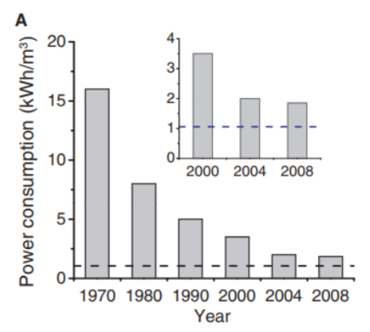
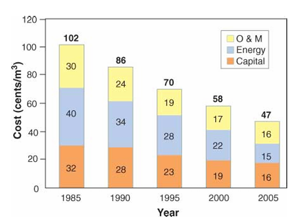
At the forefront of these advances was Israel. A patient and forward-looking government program to support reverse osmosis technology began to pay dividends, and between 1985 and 2005, desalination costs in Israel dropped by over 50%, from \$1.00/m3 to less than \$0.50/m3.
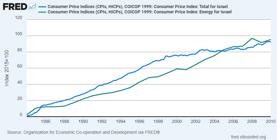
During this time, energy prices roughly tracked inflation (if lagging slightly), so it isn’t merely a case of energy getting more expensive.
If these efficiency improvements directly translated to reduced energy costs, we should have seen a 33% greater reduction. Instead, capital costs dropped by 50%.
Aside from the membranes, most of the components in a desalination plant are pretty standard items like pumps and valves. These are products that are already technologically mature and mass-produced—not things that would be expected to get significantly cheaper.
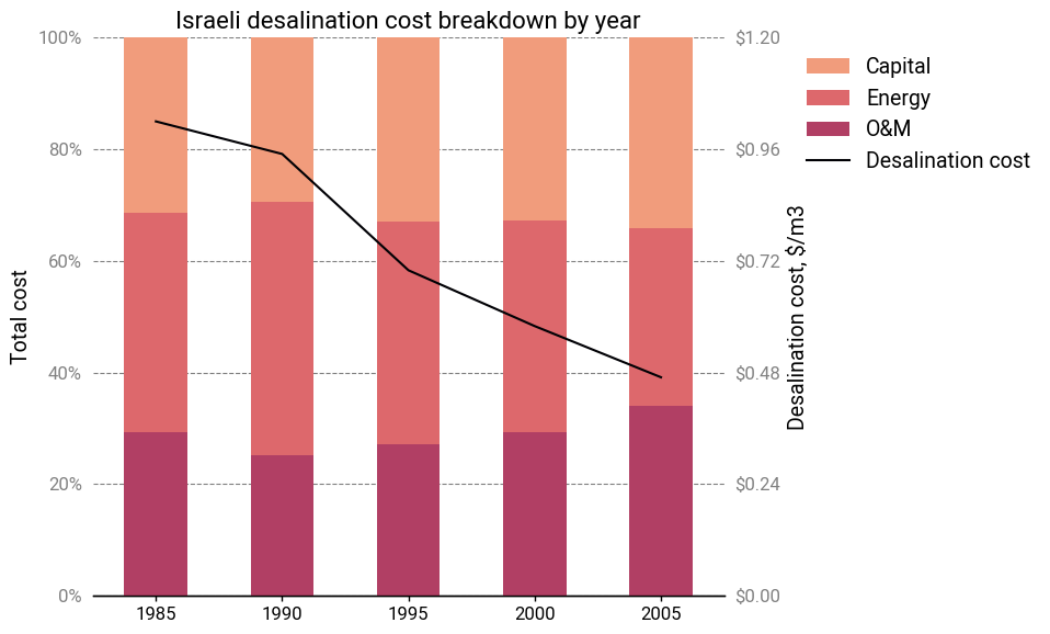
Normalizing the cost breakdowns shows an interesting trend—or rather, a lack of one. Relative energy costs decreased slightly in 2005, but there doesn’t seem to be any discernable pattern in the cost allocation. For instance, between 1985 and 1995, the membrane energy consumption dropped by half, yet the relative proportion of energy costs remained the same.
Onshore wind energy
The core technologies for utility-scale wind energy have been around since the 1980s. In the US, wind turbines initially rapidly decreased in cost. But by the early 2000’s, prices had bottomed out, stagnated and began to increase due to rising commodity prices and labor costs.
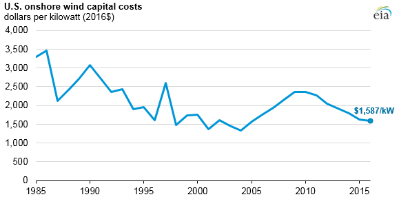
The 2008 financial crisis turned things around. A combination of government incentives, low interest rates and high oil prices was the perfect environment to spur more investment into wind energy. Deployments grew significantly and from 2010 to 2022, the levelized cost of electricity (LCOE) from wind fell by almost 70%.
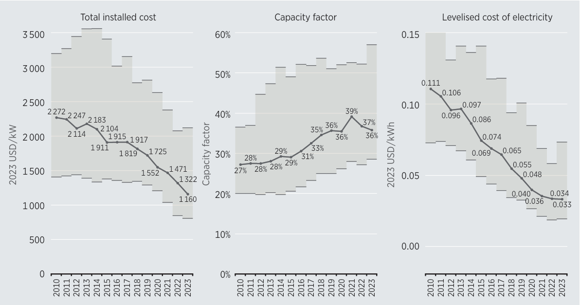
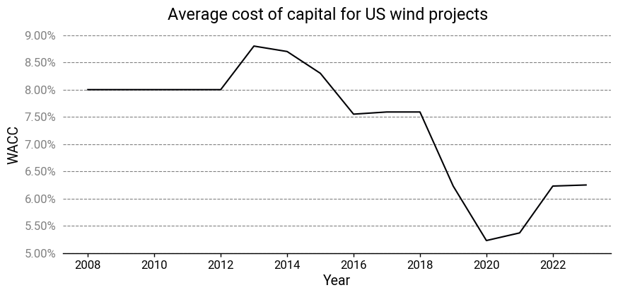
The larger volumes allowed wind turbine manufacturers to exploit economies of scale while they simultaneously started making bigger and taller wind turbines, which are more cost-effective. Technology improvements also helped, like improved aerodynamics, lighter materials, and new electro-mechanical architectures, like direct drive low-speed synchronous generators. But other less visible and less technical innovations also played a role. Better financing mechanisms allowed them to take on more debt and finance projects at a lower cost of capital.
Regulatory streamlining reduced development costs and timelines. Developers got better at site selection, with average capacity factors rising by 30% or more.
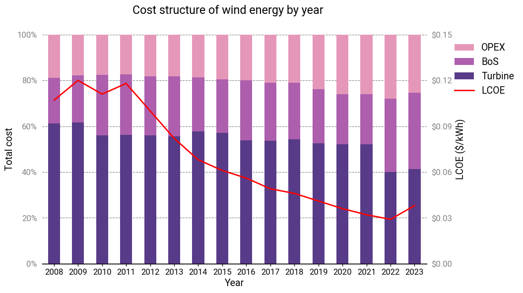
If prices remained the same over this period, then sure, one could expect the cost breakdown to be the same year over year. But here, the period with the most pronounced cost declines (2010-2021) also had a static cost structure! There’s a gradual shift towards a larger proportion of OPEX, but it only becomes prominent starting in 2020. The LCOE stops improving in 2022 and is marked by a large shift in cost structure (likely due to COVID-induced supply chain disruptions).
Again, this is very unusual. A few changes like increased efficiencies would result in across-the-board cost reductions, but this isn’t necessarily true for some or even most other improvements. They’re all subject to their own scaling laws and interactions with other system inputs. There’s no obvious reason to think a wind turbine that’s twice as large should have essentially the same cost structure. Yet it does. Larger wind turbines are actually more expensive on a per-kW basis, but somehow the concomitant reductions in financing rates and improvements in operations & maintenance were sufficient to achieve cost structure parity.
Reusable launch vehicles
The biggest development in the space industry of the past decade is undoubtedly the dramatic reduction in launch costs to low Earth orbit (LEO). On a per-kilogram basis, the cost has dropped by 80% or more5.
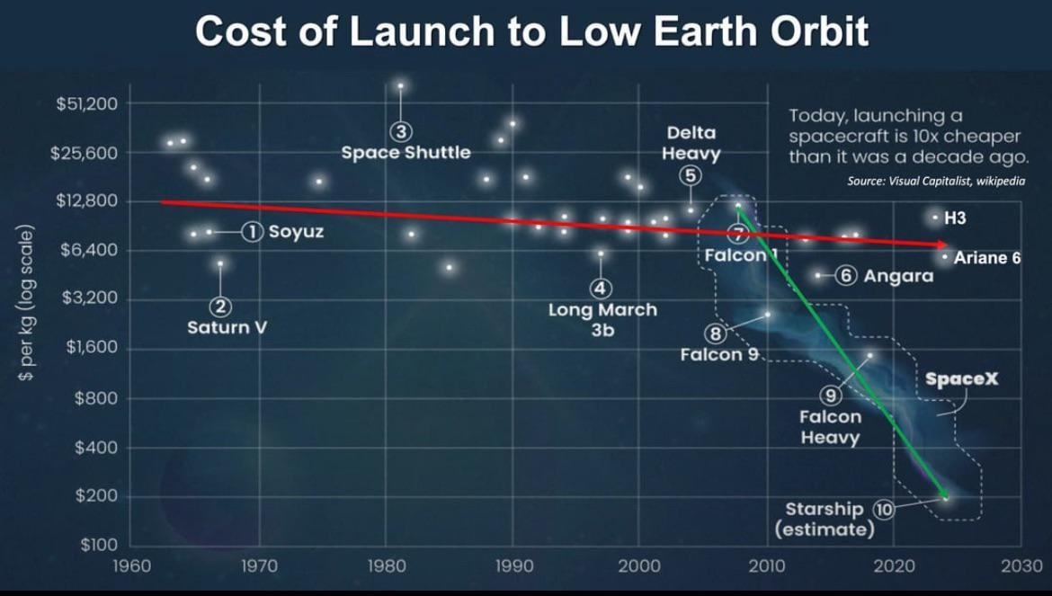
This has largely been due to a single company, SpaceX, and their reusability achievements with their Falcon 9 rocket. A decade after their first successful landing of a first stage, Falcon 9 launches—and landings—have become a matter of routine.
To the casual observer, it might seem obvious that reuse would bring down launch costs. But the reality is a bit more complex: our first experiment with reuse was, in some respects, a dismal failure.
The Space Shuttle
Reusability isn’t a new idea to the space industry. People were discussing the possibility before humanity had even achieved orbit. Serious concepts for reusability were being proposed during the Apollo Program, intended as successors to the Saturn V.
As everyone knows, those efforts ultimately culminated in the Space Transportation System, more popularly known as the Space Shuttle. To many, it remains the quintessential example of a reusable launch vehicle and a symbol of American engineering prowess. Yet, the truth is that the Space Shuttle program, for all of its technological envelope-pushing, never got close to fulfilling the ambitions of its creators.

The promise of safe, cheap and frequent access to space turned out to be illusory. From a safety standpoint, the tragic history of the Space Shuttle’s mission record is well-known. With regard to cost and cadence, Space Shuttles required extensive (and expensive) refurbishment between missions, lasting months. The 24,000 unique thermal protection tiles were incredibly brittle and each one had to be inspected after each flight. Every tile replacement was a custom-cut part and required precise fitting, alignment, adhesive application, curing and verification. The Space Shuttle Main Engines and Solid Rocket Boosters had to be disassembled and inspected between flights. After the Challenger incident, these inspections became even more stringent.
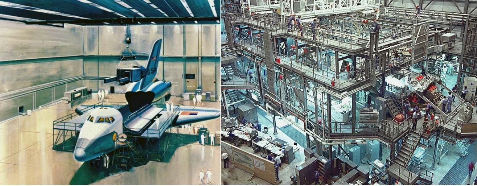
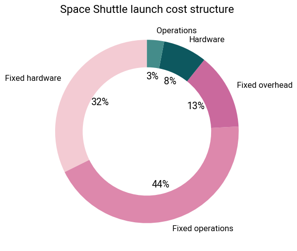
Beyond refurbishment considerations, the Shuttle’s shear complexity was problematic as well. Between the orbiter, SRBs and external fuel tank, there were over 2.5 million parts that required extensive testing to qualify them for flight. All the infrastructure required to support these operations was extensive, and the fixed costs ran into over a billion dollars annually. A 1993 GAO report revealed that the fixed costs accounted for 90% of the shuttle’s launch costs!
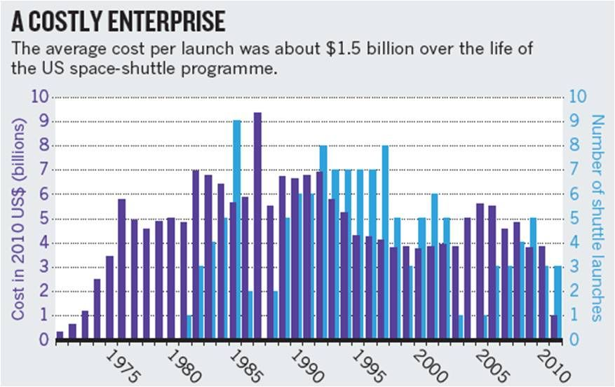
Rather than reusability bringing costs down, it led to one of the most expensive ways to reach orbit in history. Once lifetime costs were taken into consideration, the price tag averaged \$1.5 billion per launch. There was no hope of achieving a flight rate that could allow the per-flight cost to come down significantly.
To be fair, the Space Shuttle Program faced unique circumstances and many of the suboptimal decisions were a result of politicking. Its design requirements were pulling in too many directions—the result of having to make too many compromises between NASA and the US Air Force as well as poor systems engineering practices.
My point here is that reusability isn’t a silver bullet for driving down costs: the greater context matters a huge amount.
United Launch Alliance
In the mid-to-late 2000s, United Launch Alliance (ULA) was on top of the world. It had a virtual monopoly on rocket launches in America. Its “competition” consisted of young startups that spent their time burning through mountains of cash, CATOing their tiny 1,000 lb payload rockets or going bankrupt. Meanwhile, ULA was launching multiple times a year, its product line had a long, storied, and reliable history, and above all, it was profitable6. Its Atlas V and Delta IV rockets were trusted for the most demanding, complex, and sensitive missions, and it charged accordingly.

The situation looks starkly different these days. SpaceX has usurped ULA in their own niche, becoming the major launch provider for the US military and the lion’s share of commercial launch contracts. Meanwhile, it’s struggled to ramp up the launch cadence of its Vulcan rocket and has suffered several teething issues.
The reasons for its decline and struggle to compete with SpaceX are well-documented. Its parent companies, Boeing and Lockheed Martin, were unwilling to reinvest money back into the company. Political meddling to protect the SLS killed any possibility of funding for its plans for in-orbit refueling. Manufacturing problems and development delays at Blue Origin, its engine supplier, and issues with its upper stage pushed back the launch date for its new Vulcan rocket and upset the Pentagon, its main customer.
Most notable of all was ULA’s doubling down on expendable rockets at a time when SpaceX was beginning to nail its barge landings. Vulcan is a completely expendable rocket. They stubbornly insisted that reuse was an uneconomic fad7, and that Vulcan would prove to be a superior architecture.
To many, ULA is the epitome of ‘Old Space’: a pejorative thrown at organizations viewed as unfit—too slow, too stodgy, too bureaucratic, too risk-averse, too incompetent—to compete in today’s space industry. Clearly, there’s some truth to that, given their current situation, but I think there’s some nuance to the situation and more importantly, some insight to be gleaned.
I think it’s a mistake to simply dismiss ULA as being uniquely short-sighted and lacking in technical expertise. After all, their European counterpart Arianespace made a similar mistake and is now equally struggling. ULA didn’t suffer from a lack of creativity—they did cook up those concepts for in-orbit refueling and it’s not like reusability was some obscure concept. Even vertically landing rockets weren’t novel by the late 2000’s. It wasn’t so much a question of feasibility as it was one of economic viability, and ULA had found the business case uncompelling.
In 2015, George Sowers, at the time ULA’s Chief Scientist and VP of Advanced Programs, uploaded a whitepaper on NASASpaceflight (a discussion board for space enthusiasts) that explained ULA’s reasoning. His argument was that the cost of launching a rocket includes:
- Fixed costs: administration, HR, facilities, etc.
- Non-rocket variable costs: logistics, payload processing and integration, ground support equipment, launch preparation, and so on.
- Rocket variable costs: primarily rocket hardware.
The cost savings from reusability come from the last category, and then only the portion that’s actually recovered. However, there are additional costs: a reusable rocket is more expensive to build due to the more complex hardware, and incurs refurbishment costs on every launch after the first. When you add up the contribution of all these factors, the overall savings are, according to Sowers, quite modest.
I found the way Sowers set up his equations a little confusing, so I made some minor modifications to his analysis and roughly reproduced ULA’s results in the graph below8.
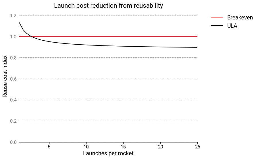
ULA claims that that the reusable hardware only comprises about 30% of the cost to launch. 70% of their expenses are unrecoverable! All in all, this would suggest that the savings from reuse would only amount to a 10% cost reduction! Regardless of how one feels about ULA’s other failings, it’s hard to blame their leadership for deciding their efforts were better spent elsewhere. With the benefit of hindsight, though, it’s plain to see that ULA was wrong, so where was their mistake?
I believe it was from assuming that a reusable rocket would be used as a drop-in replacement in an existing operational structure built around expendable rockets. Or put differently: ULA underestimated how far SpaceX was willing to go to make reusability work.
If you design a rocket with a reusable first stage, you should attempt to reduce the cost of other factors as much as possible, even if this makes the first stage more complex and expensive. For example, SpaceX deliberately sized the Falcon 9 rocket so that it would fit under overpasses9 and thus could be transported by highway from the factory to the launch pad. This required them to implement features such as folding grid fins10.

ULA, in contrast, has to transport their rockets by barge from their Alabama factory around the Gulf of Mexico to the launch site in Cape Canaveral, likely at the cost of millions of dollars.
SpaceX also employed other cost reduction strategies. They adopted extensive vertical integration and developed their own engines in-house, and used the same engine architecture between the first and second stages11. They used subcooled propellants on the first stage to improve its performance. They redesigned the payload fairings to be corrosion-resistant so that they could be scooped out of the sea and reused.
Based on public statements by Elon Musk and other SpaceX executives, the unrecoverable expenses of a launch, including the upper stage, launch operations, and refurbishment, add up to \$19 million12. At an internal launch cost “with everything” of \$28 million, that means 68% of the cost is in unrecoverable expenses.
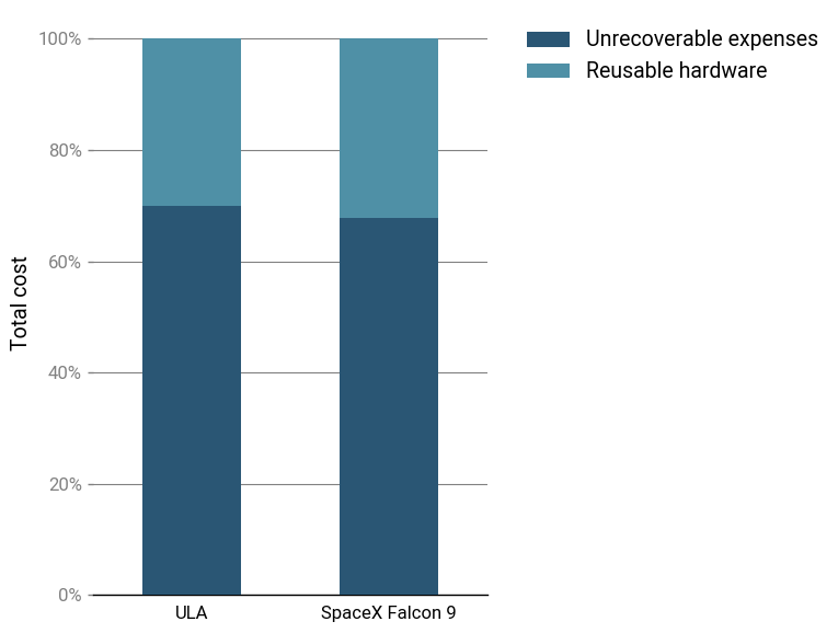
With these parameters, the reuse cost index looks more like this:
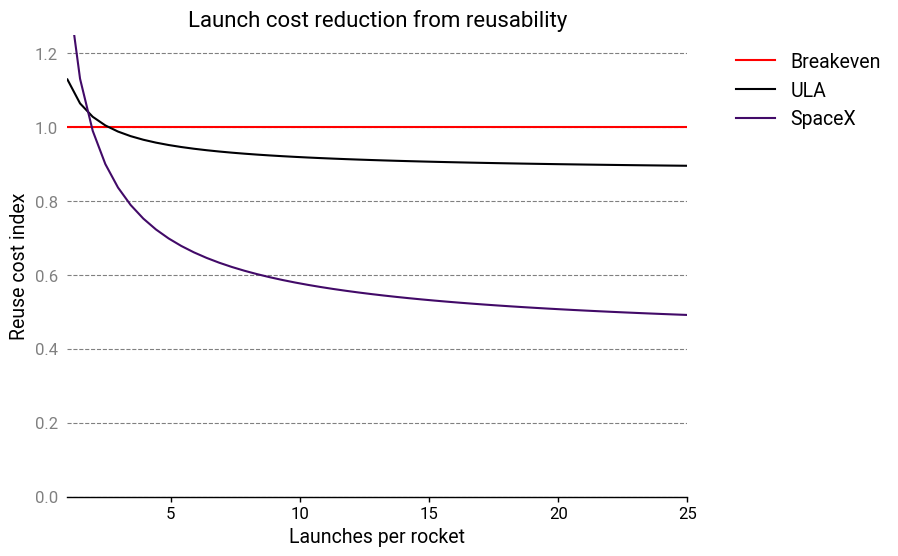
Reusability breaks even at 2 launches, and results in a significant cost advantage from 3 launches onward, as stated by Elon Musk. The long-term launch cost drops to slightly less than 50% of the baseline13. Yet the cost structure is still, in a sense, very similar to ULA’s!
To be fair, the decision to forgo reusability was far from the only factor working against ULA. For whatever reason, SpaceX genuinely seems to be able to do things much faster and more efficiently than everyone else. There’s a good chance ULA was destined to lose regardless of whatever top-down decisions they made.
Not all reusable rockets are built the same
SpaceX remains the only company with reusable rocket technology today. But other companies are now nipping at their heels, and several more reusable rockets are under development.
It’s clear, however, that simply having a high-performance reusable launch vehicle isn’t sufficient: the entire concept of operations beginning from production to qualification to lift-off must be examined.
Through the lens of cost structure invariance, SpaceX’s aspiring competitors can be assessed. In doing so, one identify the companies who stand a chance at building a competitive product from those who don’t, and those who are unserious.
Electric vehicle batteries
Over the same period, a completely different industry also saw a dramatic reduction in cost and the entrance of a disruptive player. It’s batteries—and in particular, lithium-ion batteries.
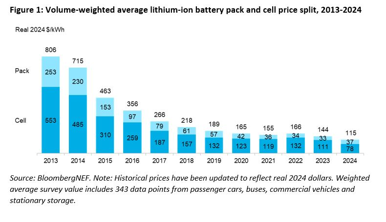
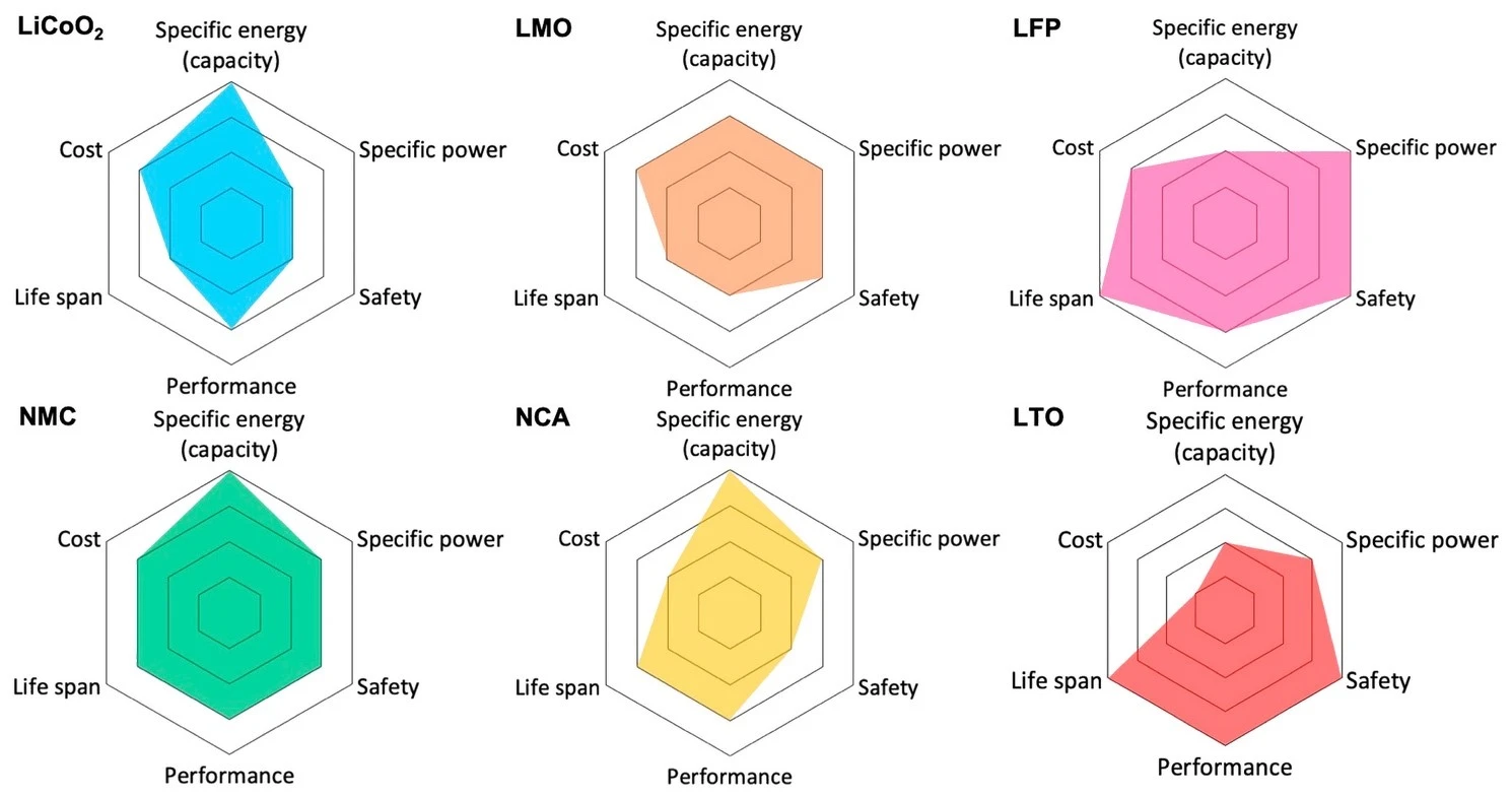
Today, electric vehicle batteries almost exclusively use lithium-ion chemistries. Why are they so dominant here? They appear to fill a sweet spot in terms of cost, performance, longevity and safety. There are 3 dominant chemistries used for EVs, which are differentiated by their choice of cathode:
- Lithium nickel cobalt aluminum oxide (NCA)
- Lithium nickel manganese cobalt oxide (NMC)
- Lithium iron phosphate (LFP)
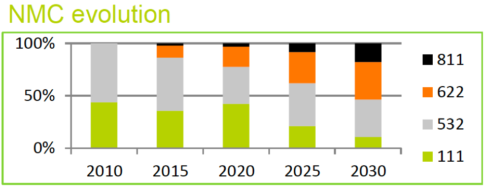
NCA was formerly the king of energy density, but at the cost of the worst thermal stability and a tricky manufacturing process. NCA was prominent in the 2010s, but modern NMC formulations have surpassed it in terms of energy density while offering superior cost, safety, manufacturability, and cycle life. There aren’t too many reasons to go with NCA in a clean-sheet design these days—most EV manufacturers are either transitioning to NMC, or already have.
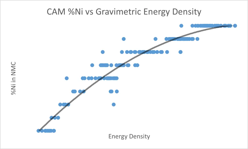
For both NMC and NCA, nickel is the electrochemically active component, and the energy storage capacity scales almost linearly with nickel content. But higher nickel content also results in worse thermal stability and a more demanding manufacturing process.
Cobalt and manganese/aluminum are used as stabilizers. One of the biggest downsides is that cobalt is expensive (roughly \$35,000/ton) and has a precarious and ethically fraught supply chain. NMC/NCA battery improvements have focused on minimizing the amount of cobalt required while maximizing nickel content.
Compared to NMC/NCA, LFP uses cheaper materials (and notably, no cobalt), has better discharge cycle life, and is much more thermally stable14. However, it also has significantly lower (~30%) energy density.
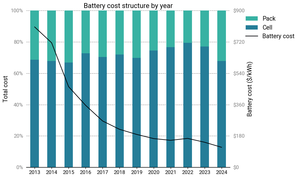
To be sure, there’s a lot more that goes into a modern battery than the active materials. For practical engineering and manufacturing reasons, an electric vehicle battery is organized into three levels: the cell, the module, and the pack.
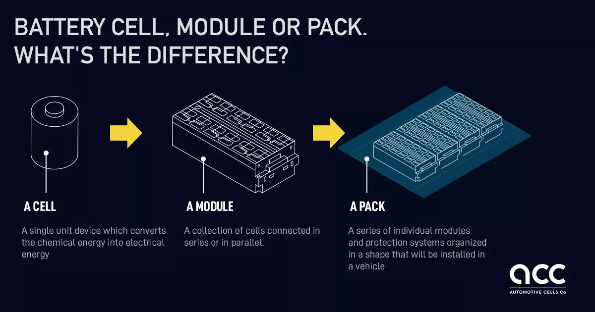
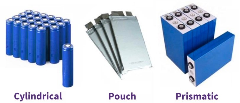
The cell is the fundamental basic unit of a battery and contains the “battery stuff”: electrodes, active materials, electrolytes, and the enclosure for these materials. The chemistry of the cell determines its charging and discharging voltage, independently of the size of the cell. Lithium-ion cells have a voltage ranging from 3.6-4.2V. Cells are built in various standardized form factors, from cylinders to pouches to prisms, to make handling easier.
High-quality battery cells are incredibly difficult to produce at large scales, requiring deep manufacturing expertise and immense capital investment. However, they are relatively easy to transport compared to modules or packs, so it’s common for battery factories to exclusively produce cells, while modules and packs are assembled in place at the car factory.
Next, cells are connected together in an arrangement called a module. Each module typically contains 6-24 cells. The module is an intermediate unit that provides standardized mechanical, thermal, electrical, and containment systems on a scale that’s more manageable than individual cells.
Finally, the modules are assembled into a pack. The pack integrates directly into the vehicle structure and provides a number of functions, like structural reinforcement, coordination with the battery management systems, and interfacing with vehicle systems like cooling and high-voltage connections.
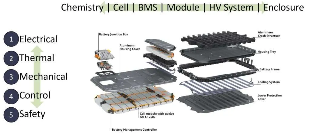
As a rough rule of thumb, the active materials comprise only about 30-40% of the weight of an EV battery. When it comes to evaluating the production cost, the calculus is more complicated than simply looking at chemistries and materials.
Bedrock Materials
The case of Bedrock Materials is an illustrative example. Bedrock Materials is a former sodium-ion battery startup that made waves when they made the unusual decision to close up shop and return money to their investors. The impetus was an internal techno-economic analysis, which has now been made public. They found that there was no economically viable path forward for sodium-ion batteries without an implausibly high and prolonged increase in lithium prices.
Bedrock’s analysis is somewhat technically dense, but it boils down to the knock-on effects of volumetric energy density. Sodium-ion batteries have a lower energy density than lithium-ion, so more cells are needed to store the same amount of energy. If the pack design remains the same, this leads to the other costs becoming a larger portion of the price per kilowatt-hour. This ends up overwhelming the cost savings from cheaper cathode materials, resulting in minimal to no cost savings overall.
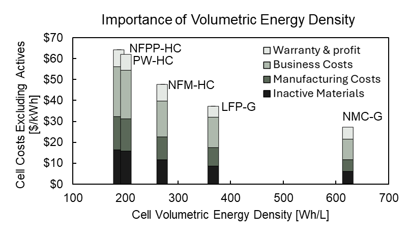
The main limiting factor in Na-ion chemistries are the hard carbon anodes. They have about 40% less charge density than the graphite anodes ubiquitously found in Li-ion chemistries.
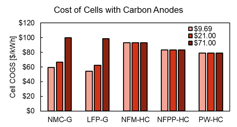
To explore the limiting factors of sodium-ion, Bedrock’s team then looked at an absolute best-case scenario: they assumed that anode-free cells could be developed15. This would shift the entire material burden over to the cathode, making the cost difference between lithium and sodium more salient. Even there, sodium-ion battery chemistries barely edged out lithium-ion at current market prices for lithium carbonate.
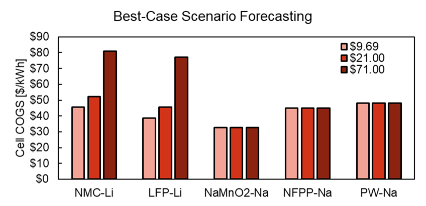
So that’s that. Is this the end of the road for sodium-ion EVs, then? Truth be told, Bedrock was just one outcome—albeit an interesting one—among many companies developing sodium-ion batteries. They’re only beginning to be introduced to the market, so it’s too early to make an assessment.
With that said, their analysis seems pretty rigorous, and it would be wise to not ignore it. Can anything be done? If so, what?
BYD
We can look at how a similar story played out in lithium-ion batteries to get some answers.
By the end of the 2010s, NCA and NMC had become the dominant battery chemistries for electric vehicles. They offered a desirable combination of reasonable cost, excellent energy density, decent lifetime and an acceptable safety profile.
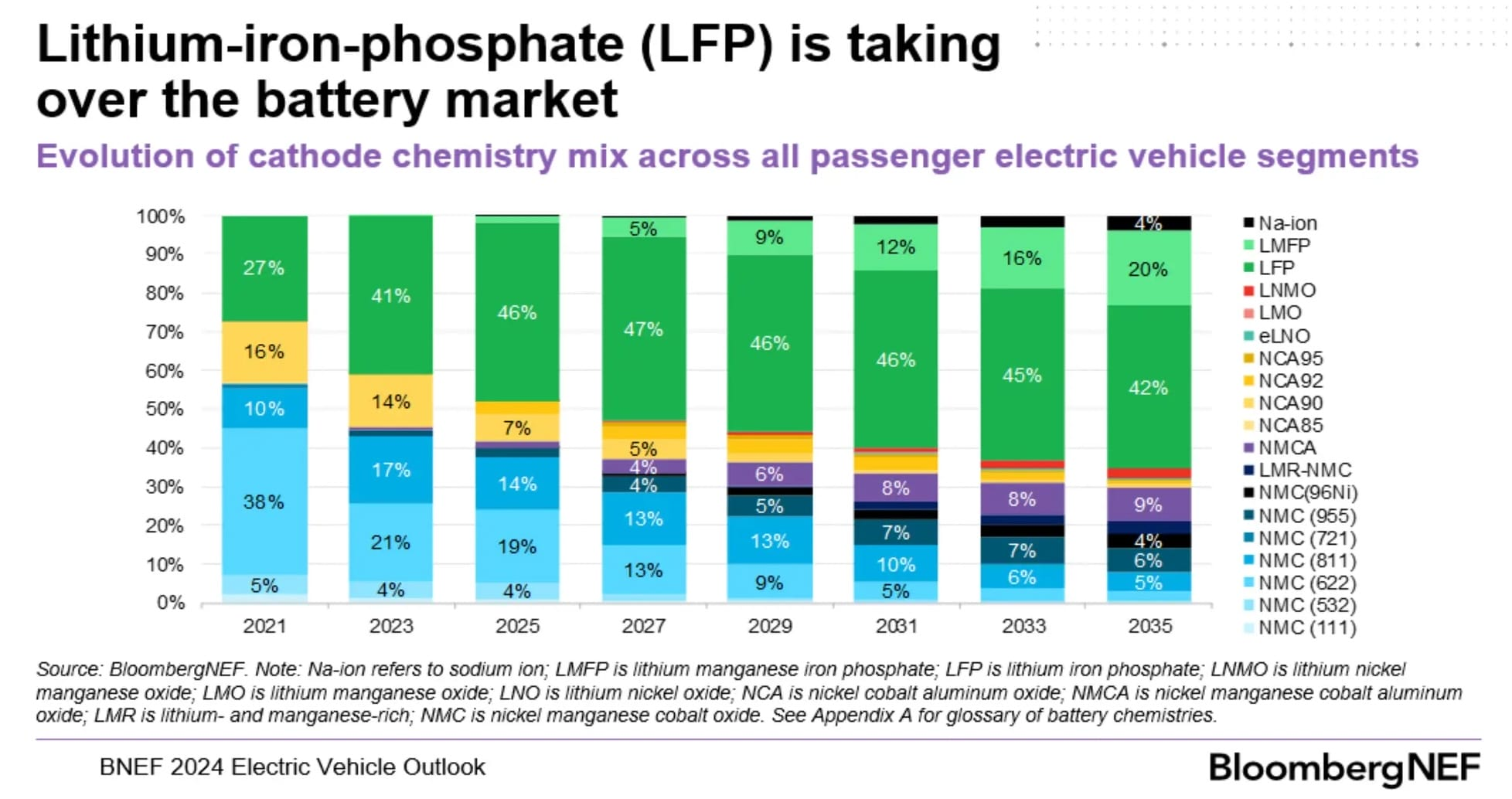
Despite their cost, safety and longevity advantages, LFP batteries were in the process of being supplanted in the EV market. The once-formidable stability and manufacturing challenges of NMC were being tamed, and LFP’s lower energy density meant that it wasn’t a competitive chemistry except for large vehicles with short ranges, such as city buses. By 2020, many analysts were predicting that LFP would be slowly pushed out of the market in favor of NMC. Some went as far as to claim that LFP would phased out of the market by 2025!
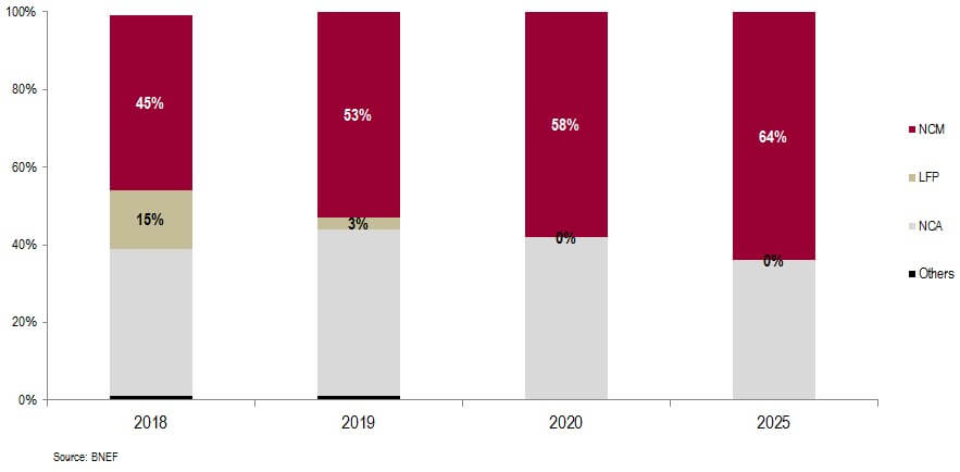
Unfortunately, that ended up aging rather poorly. That same year, BYD, a Chinese automotive and battery company, introduced their ‘Blade’ battery. It used a novel technology called cell-to-pack (CTP), where the cells were fabricated in a large, elongated form that could be directly installed into a pack, skipping the module level entirely.
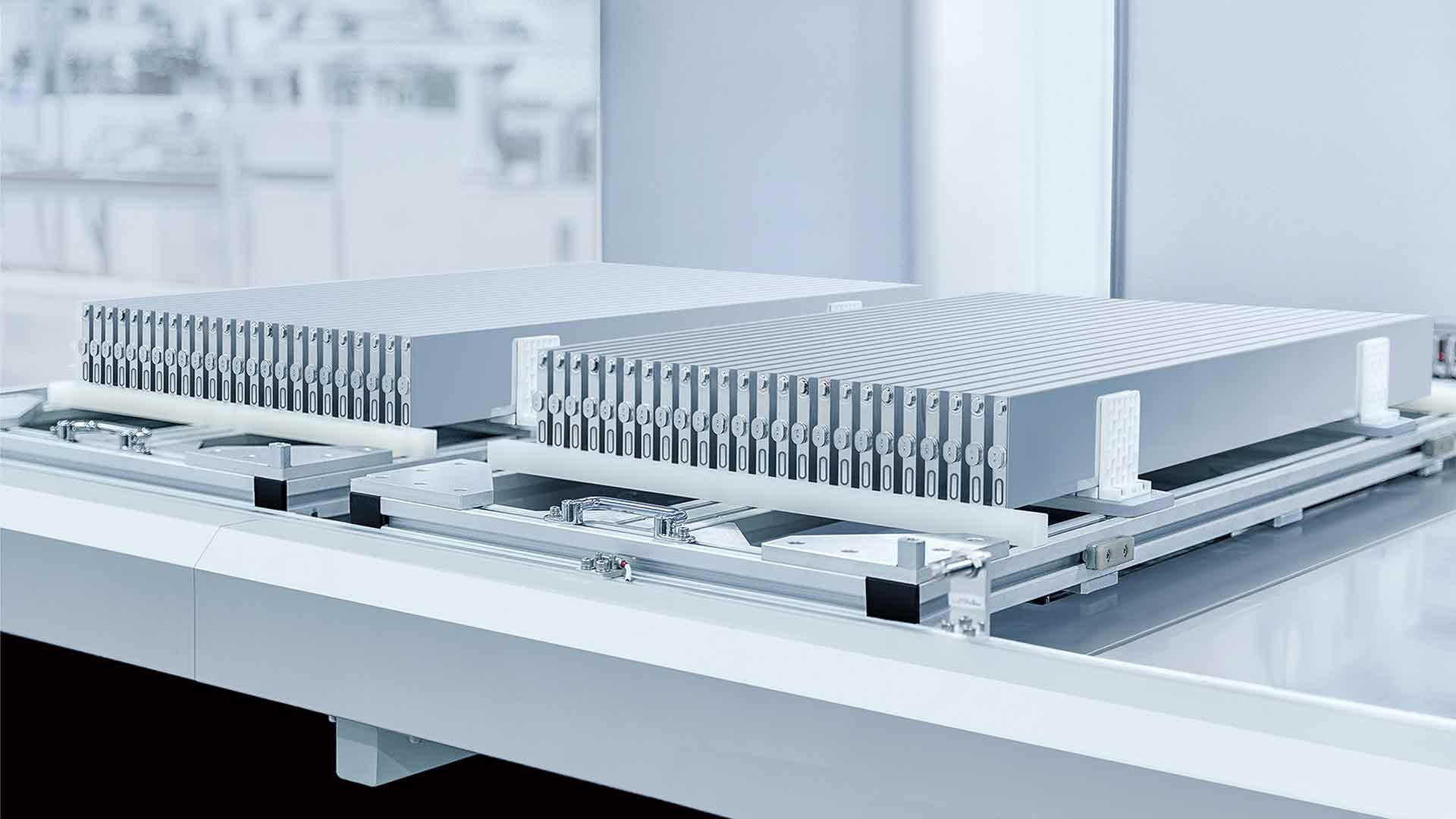
The downside of CTP is that it runs hotter due to the lack of module-level cooling. Exploiting LFP’s superior thermal stability allowed BYD to eliminate dead weight and volume and make LFP economically and technically competitive16.
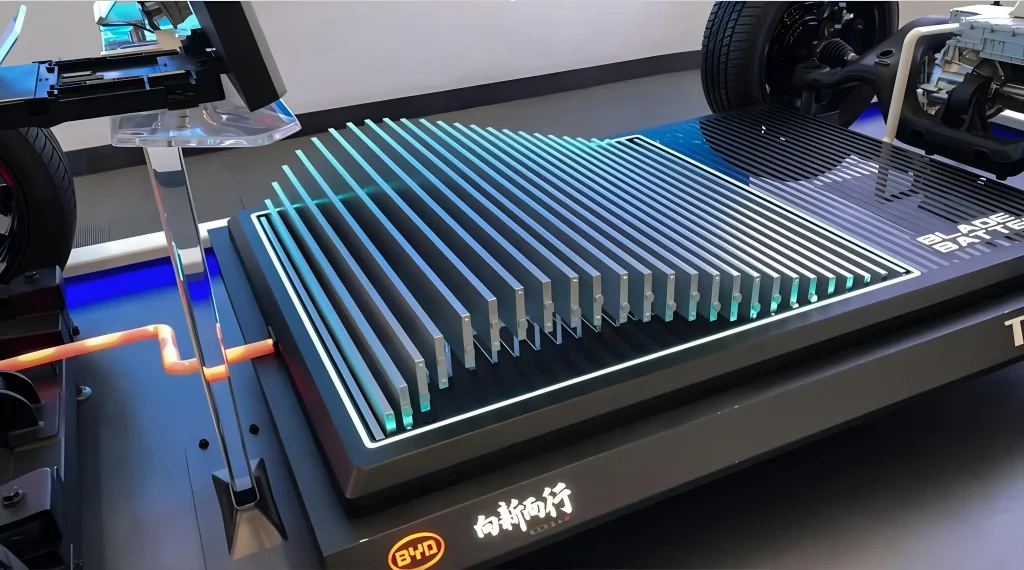
While the highest end vehicles will still use NMC, and CTP is now under development for NMC chemistries, LFP offers an attractive value proposition for entry and mid-level vehicles. It experienced a resurgence, skyrocketing to almost 50% market share in just 5 years17. The rapidity of this development caught other industry players by surprise. Most notably, it was likely a contributing factor in Northvolt’s demise18.
Was Bedrock correct?
Contextualizing this, it becomes clear that the road to competitive Na-ion chemistries lies in their specific properties vis-à-vis Li-ion, and not simply just the raw materials. For instance, Bedrock mentions that they assumed that the thermal properties were “identical” to Li-ion. Is this actually true19? I don’t know, and I don’t think anyone knows—there are too many differences between Na-ion and Li-ion chemistries for a straightforward comparison. But it seems like the answer to this question could truly make or break Na-ion in EVs.
To be clear, I’m not criticizing Bedrock’s decision to close up shop. It seems sensible enough. My point here is that the road to market entry rarely hinges on a single component.
The takeaway is that they would’ve needed to redesign the cells and the pack itself to use less materials and accommodate larger amounts of active material. But this might not have been acceptable to EV manufacturers, who could be expecting a standardized cell and pack design. The automotive industry is notoriously conservative and wary about introducing new, unproven technologies, since recalls are extremely costly. BYD was able get away with this because they were vertically integrated and willing to assume the risk of a new battery architecture in their products.
How do we draw the rest of the owl?
At first glance, cost structure invariance seems like a bizarre and counterintuitive thing to assume—paradoxical, even. There’s no inherent reason to believe achieving the same cost structure with a radical new technology is even possible, let alone optimal! It’s not even clear whether a clean trade-off between different inputs exists at all.
It gets messier once you start asking too many questions about the nature of a “cost structure”. What level of granularity is appropriate? What if the cost categories between different technologies don’t have a perfect 1:1 mapping? Do we just look at CAPEX vs. OPEX, or must we be more specific?
Even assuming the principle is true, how useful is it, really? It’s basically telling us to draw the rest of the owl. It might inform us on roughly what the goal should be, but gives us nothing about the juicy stuff: how to actually get there.
These are valid concerns, but consider other commonly-mentioned ’laws’ like Moore’s law or Wright’s law. Like them, cost structure invariance is descriptive: it’s an empirical observation that appears to roughly hold and doesn’t have any theoretical justification behind it20.
And just like those laws, its usefulness comes not from its specific quantitative predictions, but rather from using its qualitative implications to guide decision-making.
I find it a useful framework because I think it captures a few important ideas about the nature of innovation and so-called ’learning curves’. Big cost reductions may originate from a focused improvement in a small number of metrics, or the substitution of one component for a novel one. But the process of translating those gains to the market is a holistic one. This means that the potential gains are immense, but it may also require a complete re-thinking of a product from the ground up. The fundamental assumptions and requirements driving the design must be revised. If Y is a better version of X, we shouldn’t be asking “how can we replace X with Y?”, but rather “how can we use Y to get rid of the stuff that isn’t X?”
Finding the answer to that doesn’t come from staring at stuffy costing spreadsheets and nicely colored slide decks packed with bar charts—it requires time on the shop floor and a focused, deep knowledge of a problem domain. The choice of categories for the cost structure is simply what feels “natural”: perhaps because they’re reflective of some bottom-up knowledge—however superficial—of what items are result in the most representative discrete categorizations without getting lost in the weeds.
Furthermore, when requirements or assumptions about the design are externally imposed, the cost structure is no longer free to change in response to a change in the inputs. These external requirements can be due to government regulation, customer demands, bureaucracy, or just simply institutional inertia.
The end result, however, is the same. New techniques and new technologies fail to improve performance as much as expected, or even end up performing worse overall as adaptations are required to accommodate them.
Of course, “be a subject matter expert in the field you wish to innovate in, and make sure your solutions aren’t overly constrained” isn’t a particularly insightful or helpful conclusion. Yet it’s insufficient on its own. Something more is needed: the ability to simultaneously keep the higher-level architectural view in mind while juggling the low-level details, and an open-mindedness towards challenging assumptions and exploring the implications of radical and unorthodox changes.
Needless to say, doing this isn’t exactly a walk in the park! But Moore’s law never said anything about whether shrinking transistors would be easy, just that it would happen.
If there’s any lesson to be learned from the shop floor, it’s that obviousness does not imply straightforwardness.
The Santa Fe Institute maintains a database of performance curves for a wide range of products. ↩︎
Solar panels have dropped in price by over 99 percent over the last 4 decades. ↩︎
The validation step checks if the chip actually works as expected after physical prototypes are built. In contrast, verification checks whether the design should work before it’s built. ↩︎
Routing in particular is an NP-complete problem, and is completely reliant on heuristics to generate reasonable solutions. ↩︎
There are some articles claiming a 95% reduction, but this misleadingly uses the Space Shuttle as a baseline. Nobody was contracting Shuttle flights to put their imaging satellites into LEO. Although I have to admit there’s a certain irony to it! ↩︎
This remains an accomplishment that few NewSpace launch companies have achieved. ↩︎
I know some people at ULA that for a long time believed that SpaceX was committing accounting fraud in order to stay solvent. ↩︎
I can’t find a great source for this online, but I was told this by a former SpaceX executive. ↩︎
Contrary to popular belief, this wasn’t done for aerodynamic reasons, as evidenced by the Super Heavy booster whose grid fins do not fold. ↩︎
Before SpaceX, this was a fairly uncommon practice. Perhaps because the cost savings weren’t worth it for expendable rockets, and it was more important to squeeze as much performance out of the upper stages as possible. ↩︎
The upper stage is \$12 million. Launch operations are another \$6 million. Refurbishment is \$1 million, give or take. This adds up to \$19 million in total. ↩︎
SpaceX charges $65 million for non-Starlink flights. ↩︎
It isn’t as simple as a clean trade-off between “energy density” and “thermal stability”. LFP has properties that make it an intrinsically stable chemistry, independently of its ability to store energy. ↩︎
The technical details are beyond the scope of this (already very long-winded) essay, but just to be absolutely clear, this is an extremely optimistic assumption! It’s on a similar level as assuming we’ll have widely available and commercially viable fusion energy in 5-10 years… ↩︎
Asianometry has an excellent video on LFP batteries for more detail. ↩︎
To be fair, most of that growth has been in China. Market penetration in Europe and the US has been more limited. ↩︎
Northvolt’s core thesis was essentially “NMC is good enough to electrify cars; we just need to go all in on NMC and massively scale up production.” The timing of LFP’s surge couldn’t have been worse, as it happened just as they had committed billions of dollars in funding to their Skelleftea factory. ↩︎
One obvious example: we know sodium-ion performs much better at cold temperatures. Could that eliminate the need for heating systems? ↩︎
That’s not to say we can’t give a handwavy, qualitative explanation. Heuristically, I would expect that the “surface” of such a complex, multivariate, multi-causal optimization function is likely to be “smooth” and “flat”, with gentle slopes. Dramatic changes to the “optimal allocation” in response to changes in inputs are rare. ↩︎